My 1st Corporate Experience in UX
Navistar: Enhancing over 1 million truck drivers’ emission test experience
Automating the CARB Clean Truck Check emission test process of heavy-duty vehicles.
Role
UX Design Intern
Interaction Design, UX Process Standardization
Time
May - August 2023
XFN Team
1 Product Owner, 1 Lead Designer, 1 Business Analyst, 4 UI Engineers
Tools
Figma, Mural, Google Analytics, Zeplin, Excel

My two projects during the internship
What did I do?
Standardized UX processes across 5 teams, conducting 10+ interviews, organizing resources, and creating templates to streamline workflows.
Why was it done?
5 teams each had its own UX process and templates, leading to inefficiencies and duplicated efforts.
Impact?
Cut in design delivery time
What did I learn?
Balancing everyone’s needs and keeping everyone happy is challenging. After hearing all perspectives, it's crucial to evaluate carefully and make decisions decisively.
What did I do?
Led the CARB Emission Test project, delivering user research, competitive analysis, 4 user flows, and 80+ pages of wireframes and prototypes.
Why was it done?
In 2024, the California Air Resources Board mandated biannual emissions testing for heavy-duty vehicles. Navistar aimed to assist fleets by automating the testing process.
Impact?
Reduction in testing time
Reduction in testing cost
What did I learn?
Getting push-backs is ok and common. It’s crucial to empathize with colleagues, and collaborate to find compromises.
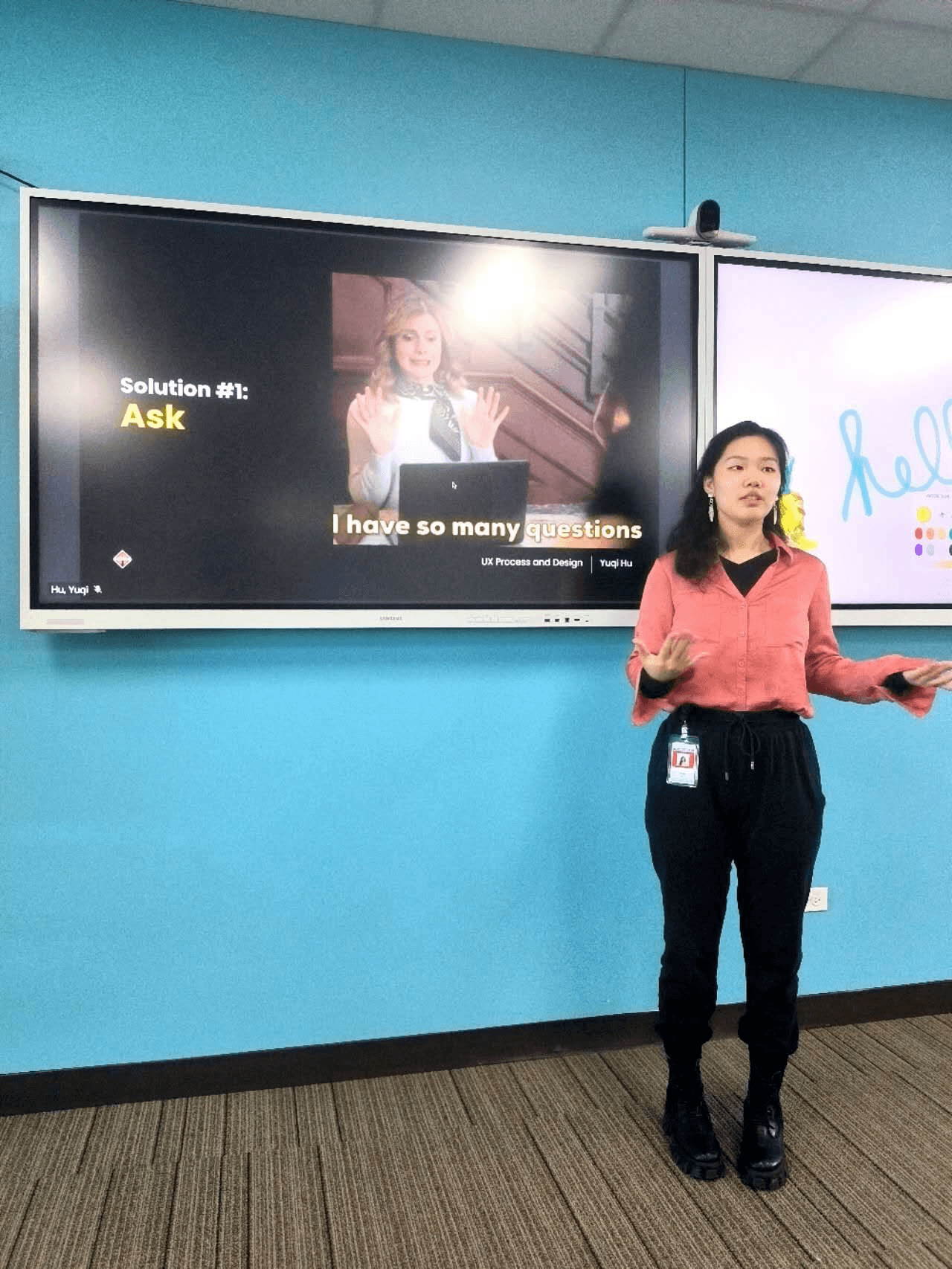
I was praised exemplary for my performance
A New Mandated Emission Test in California
It’s a mandated regulation requiring heavy-duty vehicles to undergo emissions control system tests for proper operation, increasing from twice a year in 2024 to four times a year by 2027.
A glance at what Yuqi created!

I encountered many challenges...
Complicated domain knowledge
This was a brand new policy, so a lot of technical parts were not figured out by my boss yet. Each meeting, there could be new information.
It’s my first time working in a trucking company, so I struggled with the jargons
0-1 product without direct competitors
This means the product could either soar to great success or crash and burn. To avoid crashing, we need to understand what users really want and what is the best way to help them.
Talking to users was hard
I wasn’t allowed to speak with users until after completing the wireframes. The business rationale was that users wouldn’t fully grasp the product’s purpose until we could present a visual representation of what it might look like.
My two ways of tackling

Initiate Stakeholder Meetings
Determine business goals
Get user data and push for user research
Learn domain knowledge and clarify unfamiliar concepts
Book Designer Meetings
Learn how they work
Get design resources and templates
Constantly ask for design critique
Get user data, existing personas and user journeys
Dig into Forums and Reddit
Learn user’s perspective and their frustrations
See how they envision to solve the problem without our service
Learn from Similar Products
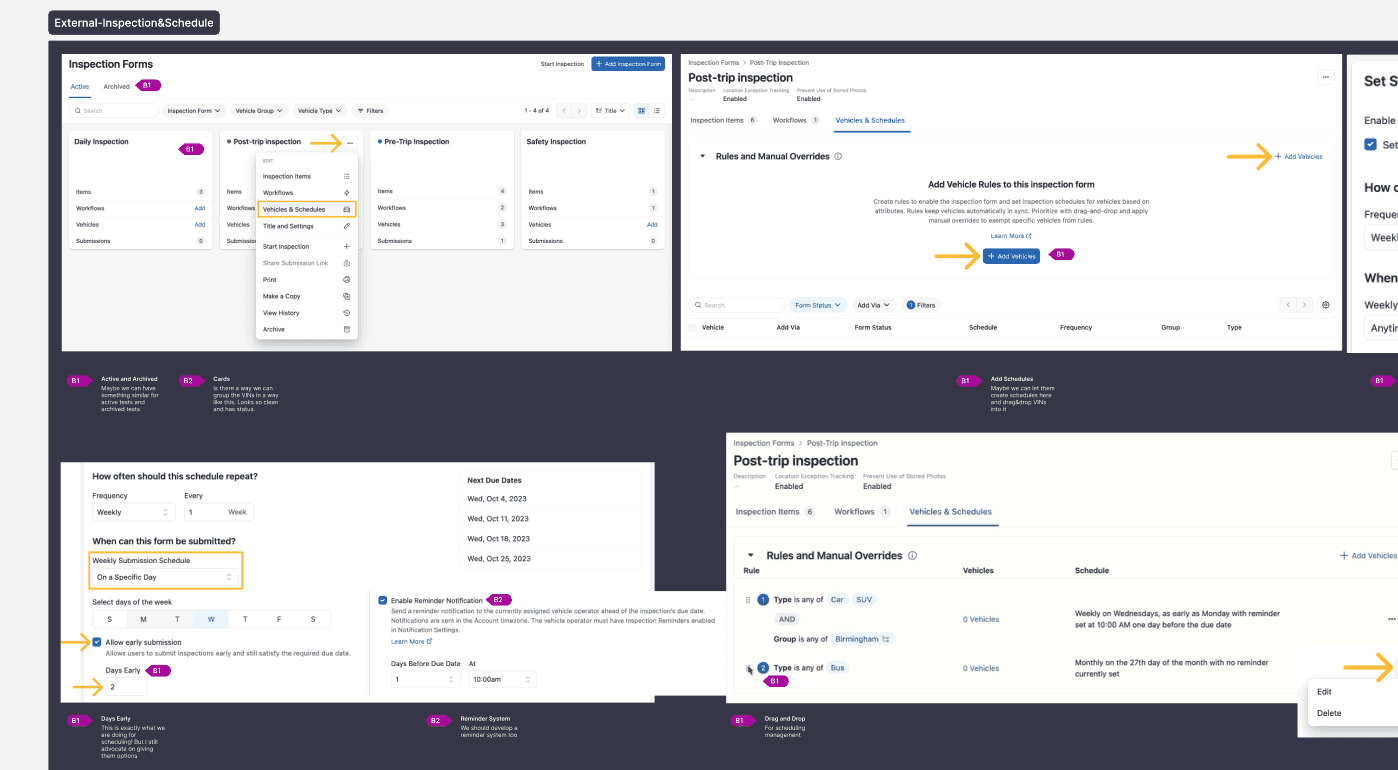
I took the time to capture and annotate screenshots of relevant inspirations, highlighting key features and potential opportunities for our product
Internal Products
Inspection scheduling
InControl portal charging scheduling
External Products
Fleetio and Samsara Schedules
Google&Teams Calendar
Auto-payment process
Synthesize all findings!
Who were we designing for

Fleet Manager
who either

has fleet based in California
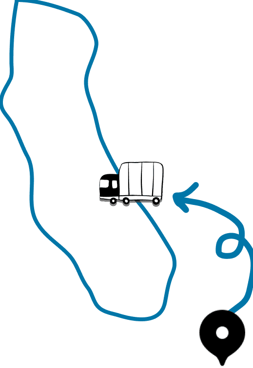
has fleet traveling to California
OR
Their current process
Pre-Test
Post-Scheduling
Actions
Logs VIN details and tracks each VIN’s test history
Manual calculates due dates for each truck
Trains staff for testing
Challenges
The problem

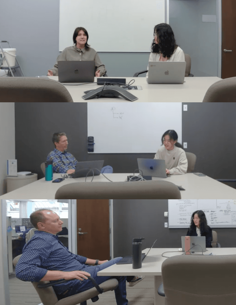
In the early stage of design, because of absence of user input, I referred to industry standards and actively engaged with designers across the company. Designers with extensive experience in similar products often have an instinct for what will work, and their feedback was invaluable. By the end of my internship, I was able to connect with a few users, whose insights significantly enhanced my decision-making.

laptop
xN
Industry standards

user
x20
Designer 1v1

users
x10
Product Team

users
x4
Design Group Critique
Challenge:
Designing for Scalability
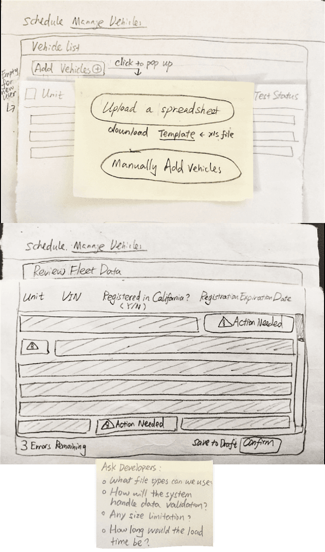
The fleet size can range from as few as one or two vehicles to thousands. The primary design challenge is creating a solution that accommodates both extremes while remaining user-friendly.
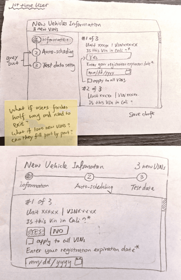
Idea 1: Pop-Up Window with Left/Right Columns
This design features a two-column layout. On the left, users see the steps they need to complete, while the right column displays the vehicles requiring information. Users can apply the same information to all vehicles or fill in individual details. They can also save their progress and return later if they need to pause midway.
check
Pros
Step-by-step sections guide users through the process, ensuring clarity and progress.
Ability to apply information to multiple vehicles at once saves time.
times
Cons
The pop-up screen is too small for such a complex task, making the process feel cramped and temporary for an activity that requires more space and attention.
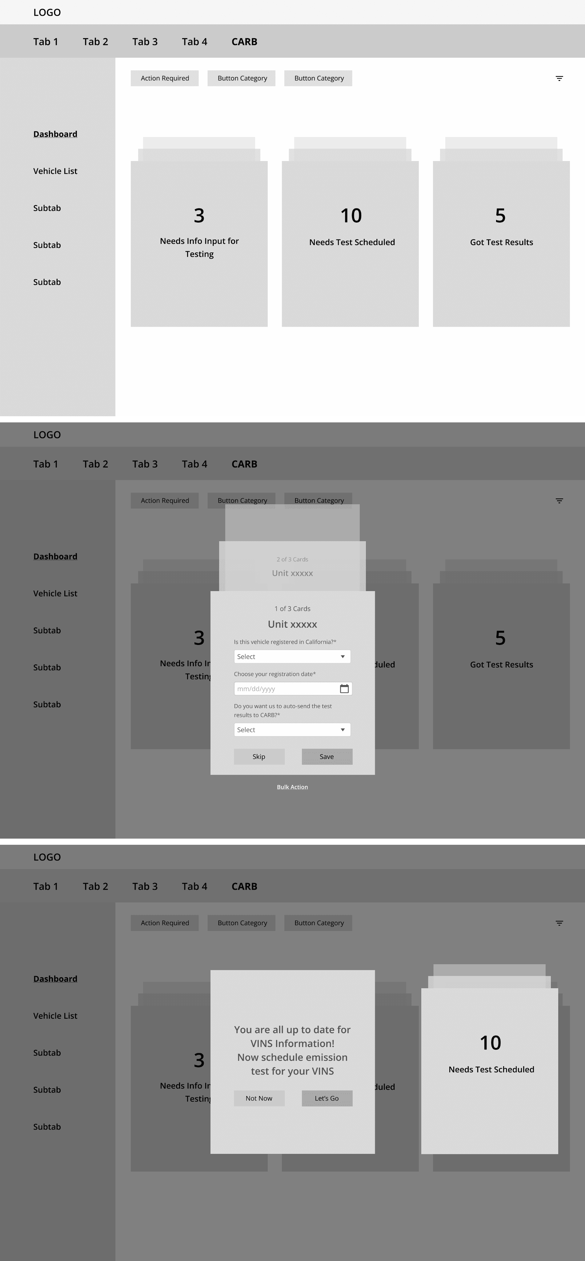
Idea 2: Card Swipes
This design takes an outside-the-box approach. Action items are categorized into three sections, and users can click on an information block to fill out details for each vehicle, swiping up and down to navigate between them.
check
Pros
Action items are clearly categorized, making them easy to access.
Users can focus on one vehicle at a time, reducing cognitive load.
times
Cons
The design might be unfamiliar to users, requiring a learning curve.
Users may need to repetitively enter similar information for each vehicle, which could be time-consuming.
Idea 3: Smart Upload
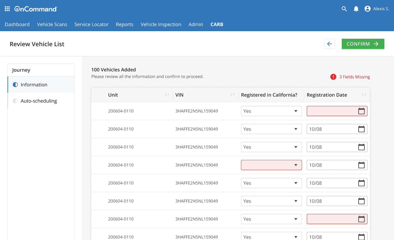
In this design, users can download a premade template, fill out all the necessary fleet information, and upload it as an Excel file. The system scans the file, converts the data into a table, and highlights any missing information. Users can then review, edit, and confirm the details in a new window before submitting.
check
Pros
Streamlines the data entry process, especially for large fleets.
Minimizes repetitive manual input by allowing users to bulk upload.
Automated error detection highlights missing or incomplete information.
times
Cons
Users unfamiliar with Excel or templates may find the process challenging.
Requires switching between software (Excel and the system), which may interrupt workflow for some users.
Idea 3 was chosen because of its scalability and error reduction
The ability to upload fleet information in a preformatted Excel file reduces the repetitive data entry that the popup and card designs would require, especially for larger fleets. This design cuts down on manual input, which is particularly beneficial when dealing with hundreds or thousands of vehicles.
What’s the best way to display test schedules?
Challenge:
Managing Massive Information without Overwhelming the User
The challenge was to display numerous dates and information—such as registration expiration dates, two annual test submission deadlines, and scheduled test dates—while keeping the interface easily accessible and avoiding information overload.
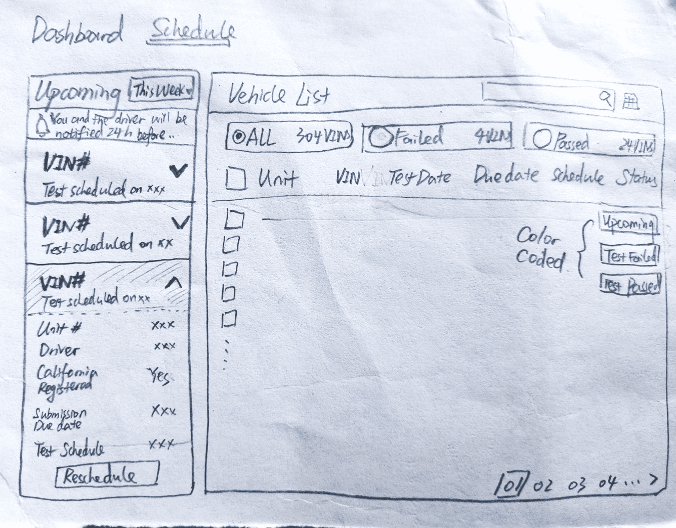
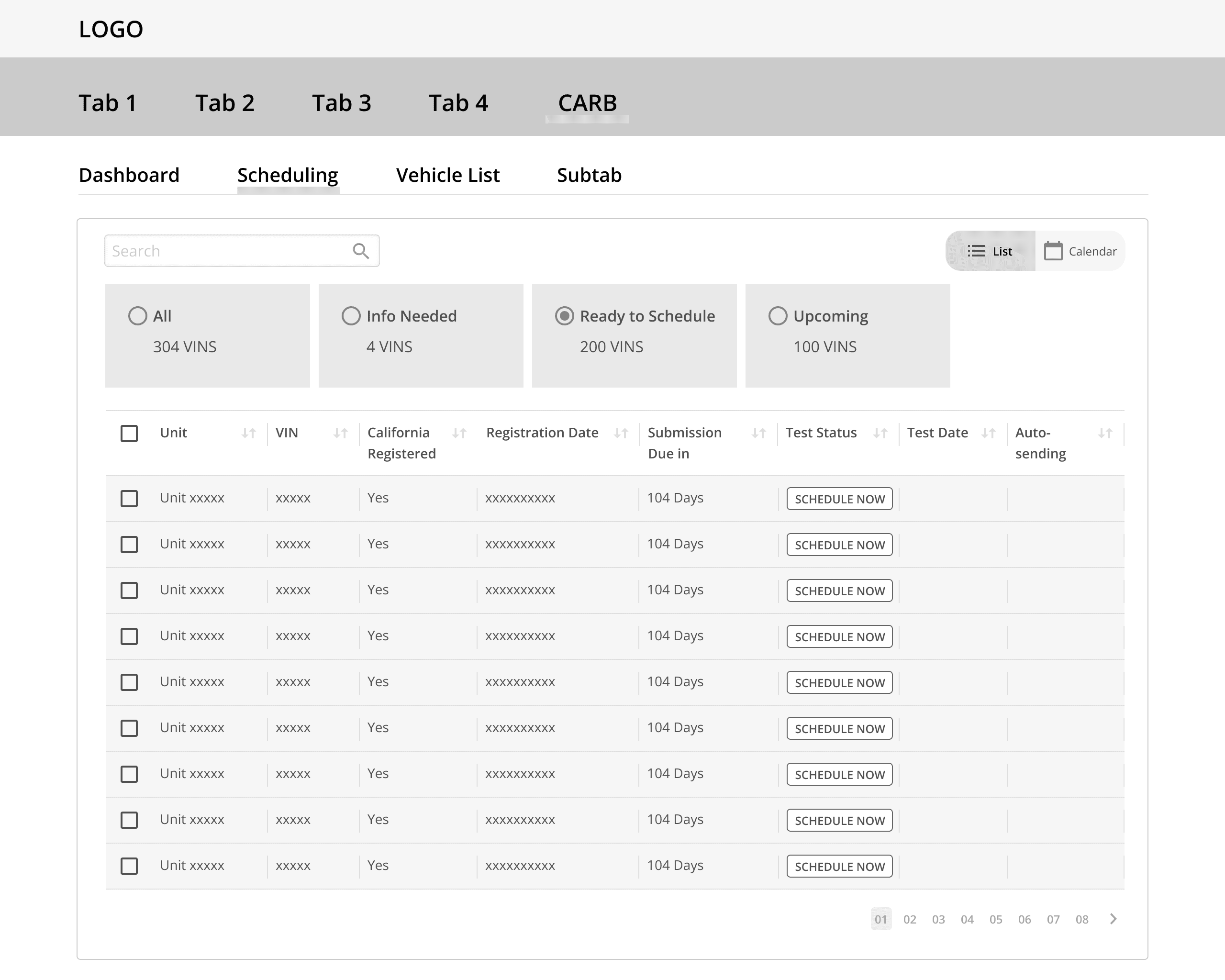
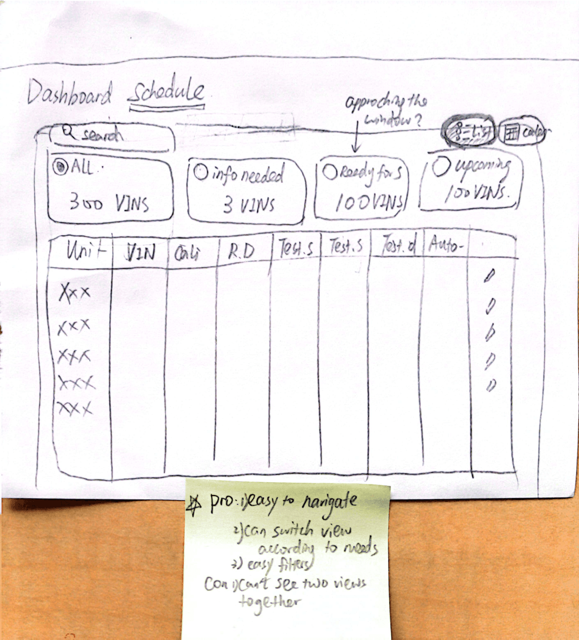
Idea 1: Table
This design mirrors the layout of other Navistar products, presenting clear information in a simple table format
check
Pros
Familiar layout for existing users, making it easier to navigate and understand.
times
Cons
Lacks visualization of schedules, making it harder for users to easily grasp testing timelines or deadlines.
Idea 2: Split Table
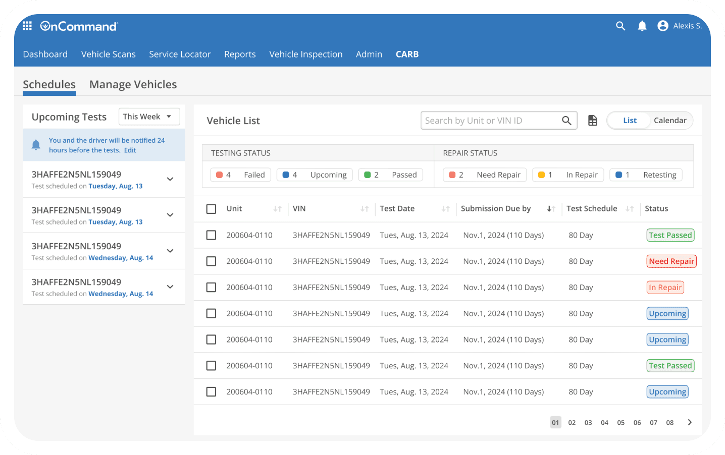
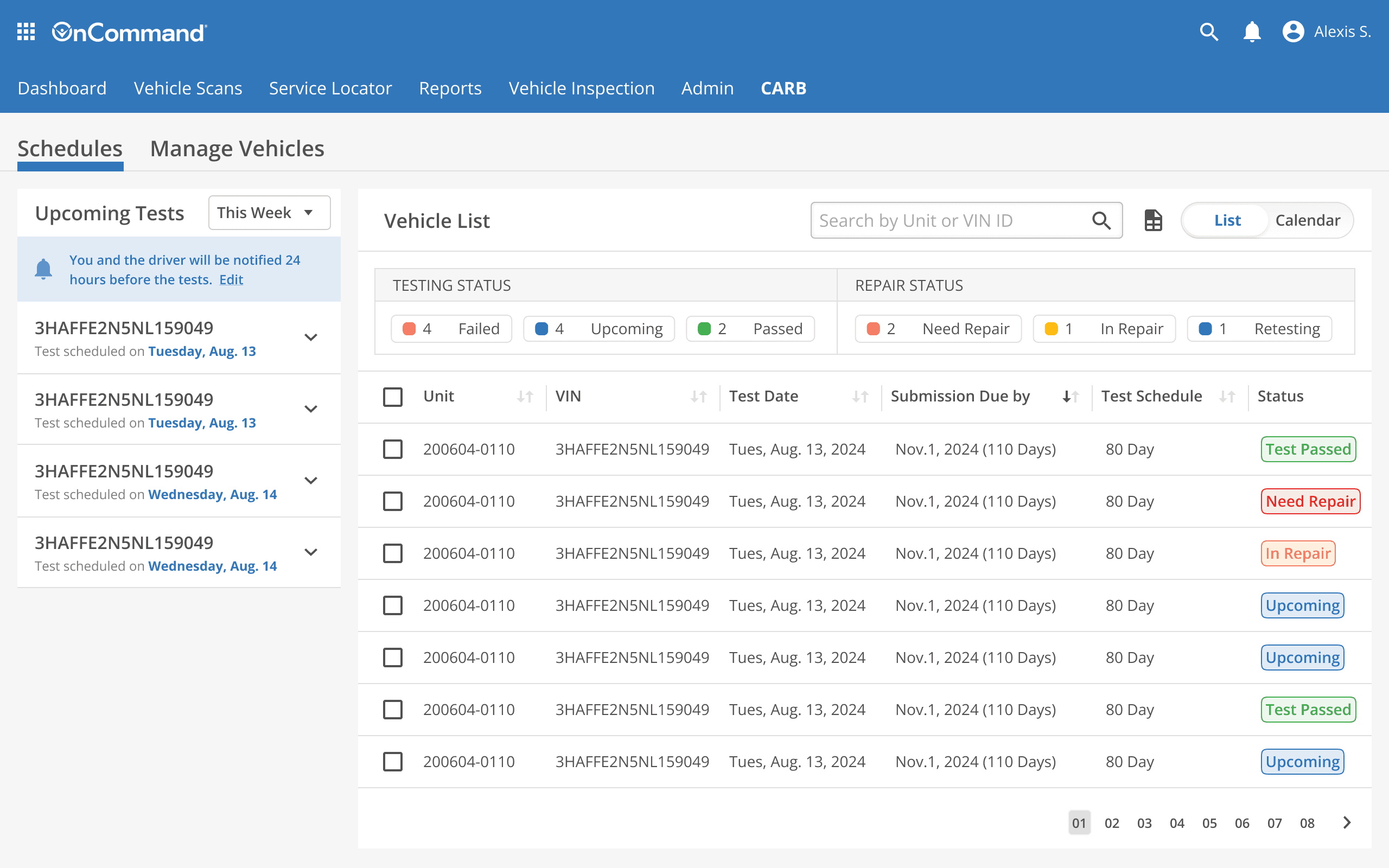
This design features a split view. On the right side is the main table with filters for “all,” “upcoming,” and “failed” entries, showing key dates. On the left side, users see a list of upcoming tests with options to filter by time range (this week, month, or today).
check
Pros
Allowing users to see detailed information and an overview at the same time.
Status filters make it easy to manage.
times
Cons
Requires users to manage and switch between multiple filters and views, which could add cognitive load.
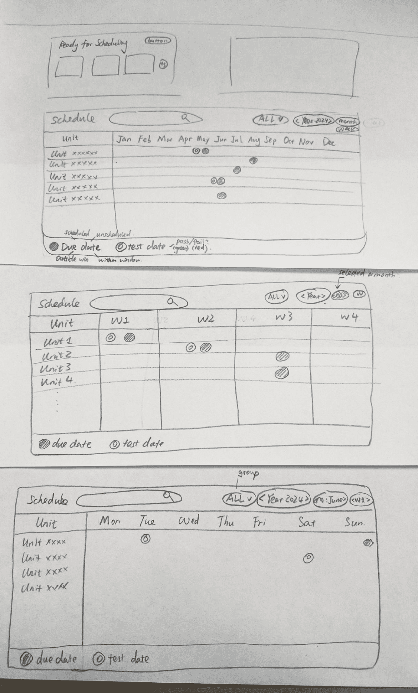
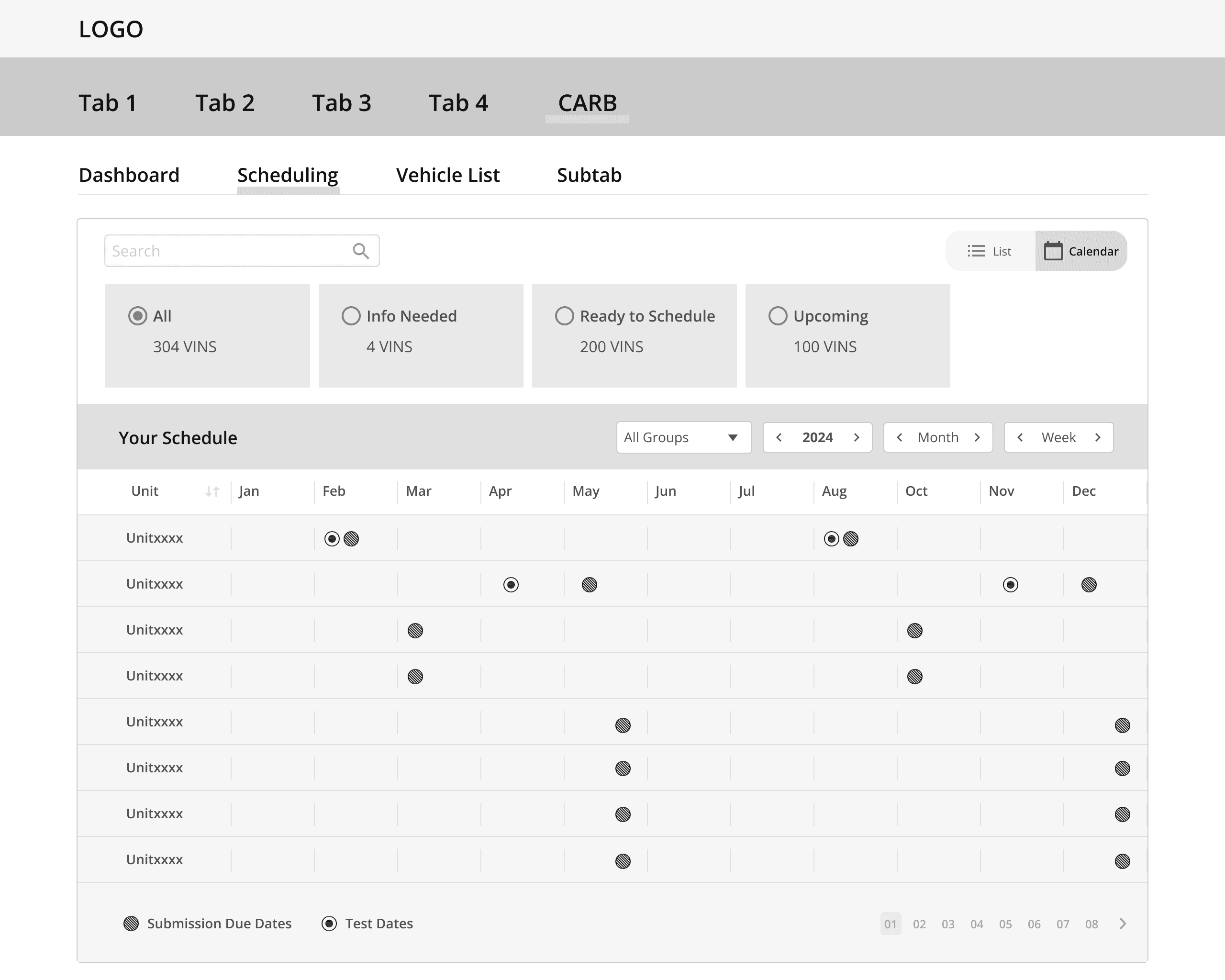
Idea 3: Calendar
This design is a visualized schedule displaying different colored dots to represent various dates, such as submission due dates (for both scheduled and unscheduled tests) and test dates. Different colors indicate test results (pass or fail). Users can apply filters to select specific vehicle groups and time frames. The default view is yearly, but users can switch to monthly or weekly views for more detailed information.
check
Pros
Offers an intuitive, visual representation of schedules, making it easier for users to understand testing timelines at a glance.
Flexible filtering options allow users to customize the view by vehicle group and time frame, making it adaptable for different fleet sizes.
times
Cons
May become cluttered with too many vehicles or test dates, making it harder to focus on specific details.
Lacks detailed, text-based information that a table view offers, requiring users to click through for more in-depth data.
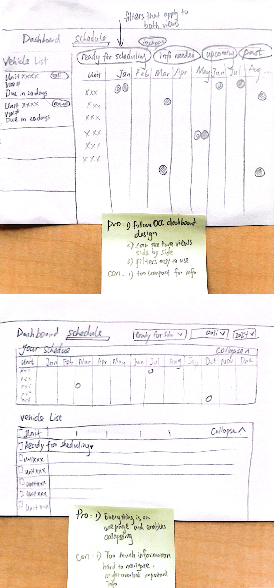
Idea 4: Table + Calendar
I explored combining a table with a calendar view. The first version places the vehicle list on the left, showing critical information like how many days remain until a test is due, while the calendar is on the right. The second version features a condensed dot-schedule calendar at the top and a detailed table view below, with an option to collapse each section for better focus.
check
Pros
Offers both detailed data (table) and visual overview (calendar), catering to different user preferences.
Users can quickly switch between seeing a list of vehicles and their schedules.
Provides flexibility with the collapse option, helping users manage screen space and reduce clutter.
times
Cons
May overwhelm users with too much information on one screen, especially with large fleets.
Managing two different views (table and calendar) could complicate the user experience and add cognitive load.
Winner: Table default view, calendar alternative view
Users favored a clean table view as the default, particularly appreciating the "upcoming" tag within the table itself. The additional section for upcoming tests on the left was seen as distracting and unnecessary, leading to information overload. However, users liked the idea of the calendar view and suggested offering it as an alternative option, allowing for a more visual representation when needed, without cluttering the main interface.

User Interviews and Iterations
After finalizing the wireframes, I reached out to users to clarify their processes, confirm pain points, and gather feedback to iterate on our solutions.

laptop
User Journey Clarification

user

tasks
Task-based usability tests
We got very constructive feedback
View Calendar
What I learned
It’s common and ok to get pushbacks, and it's ok to push it back
It’s common and ok to have disagreements! we are never fighting against each other but pulling together to a shared goal. Learn to empathize with colleagues' perspectives, while also not be afraid to vocalize your own point of view. Trust yourself and seek support from other designers as needed.
Think about how to help, not how to impress
As an intern or newcomer, it’s easy to feel pressured to make a good impression. This mindset can lead to fear of making mistakes, which are a crucial part of learning. By shifting my focus toward helping and adding value, I adopted a more creative mindset, made a lot of positive changes bravely, and ultimately grew much faster—receiving an outpouring of praise.

Small deeds, big love, lasting impact!
If you want to know more about me, or if you just want a chat,
do check out the links I’ve left for you here.
Want to get in touch?

